Day #01: points
Day1: plot a map with points
By Larissa Cury in R
November 1, 2022
Day1’s category is: points. It should be VERY clear that this was my FIRST attempt to plot a map using ggplot2 , so , please take this disclaimer into consideration 😅 . You should be able to access the whole
script here 😃
Day1: points
Following a tutorial
Since I’ve never plotted a map before, I googled a bit until I found
this video (in Portuguese). I’ve completed the whole tutorial and upload the script. If you want to check that out, please check my GitHub link above. If you don’t speak Portuguese, that’s all right, I’ve commented the script in English, so, hopefully, you’ll be able to follow it along. (all rights belong to the original creator, of course) 😃
Ploting the distance between UFRJ and UFRGS
After completing the tutorial above, I’ve tried to come up with a map myself. I’ve plotted the distance between UFRJ, where I concluded my undergraduation, and UFRGS, where I’m currently taking my master’s degree:

Enough talking! Let’s check the code out?!
Step 1: Load the relevant packages:
### Maps challenge

library(tidyverse)
library(rnaturalearth)
library(rnaturalearthhires)
library(stringr)
# devtools::install_github("AndySouth/rnaturalearthhires")
Step 2: select the desired state(s):
### filter Brazil:
BRA <- ne_states(country = "Brazil",
                 returnclass = "sf") ### file' class: 'simple features'

### plot the whole df if you want to:
##plot(BRA)

### filter the desired state(s):
States <- BRA %>% filter(postal %in% c("RJ", "RS"))
Step 3: enter universities' coordinates:
You’re able to get the universities' coordinates from Google Maps:
Then, just add them into vectors:
Names <- c("UFRJ", "UFRGS")

lat <- c(-22.8604, -30.0722)
lon <- c(-43.2249, -51.1181)
Step 4: get the distance between them:
You may want to check this out
library(geosphere)

distance <- distm(c(-43.2249, -22.8604), c(-51.1181, -30.0722), fun = distHaversine)
Step 5: Add the vectors to a new dataframe:
dat <- data.frame(Names, lat, lon)

### put names as factor and reorder it:

dat <- dat %>%
       mutate(Names = factor(Names, levels = c("UFRJ", "UFRGS")))
Step 6: plot with ggplot2:
day1 <- ggplot() +
  geom_sf(data = BRA, fill = "#D3D3D3") + # plot Brazil's map behind it
  geom_sf(data = States, color = "black", fill = "#96DED1") + # color of the map's border (color); color inside of it (fill)
  geom_line(data = dat, aes(x = lon, y = lat)) +
  geom_point(data = dat, aes(x = lon, y = lat, color = Names), size = 3.5, shape = 18) + # since the challenge required a map with points
  scale_color_manual(values=c("red", "#800020")) +
  theme_light() +
  geom_text(aes(x = -42, y = -26, label = str_glue("{round(distance/1000, 2)} km"))) +
  labs(x = "Longitude",
       y = "Latitude",
       color = "University:",
       title = "Distance between 'Faculdade de Letras' (UFRJ) and 'Instituto de Letras' (UFRGS)") +
  ylim(-33, -10) + # adjust the y-axis
  theme(legend.position = "right",
        legend.background = element_rect(color = "black"),  # legend block
        axis.text.x = element_text(angle = 0, hjust = 0.5, face = "bold"), # caption
        plot.title = element_text(hjust = 0.35, face = "bold"),
        axis.text.y = element_text(face = "bold"))
Step 7: Visualize it:
Here it goes!
day1
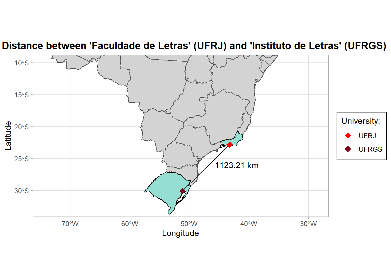
This is a very basic map, any suggests are always welcome! Make sure to check the others map out on twitter using the hashtag #30DayMapChallenge 😆
🐕 Au-au! Today we’ve made our very first map using ggplot2 in order to complete the #30DayMapChallenge. We’ve followed a very nice tutorial on Youtube on how to plot Brazil’s map in #RStats. The video is in Portuguese, but Larissa made the script available with English comments on her github depository (all rights belong to the video’s author, of course). Today’s category was points, so we’ve plotted a map using geom_point() to indicate UFRJ and UFRGS locations on Brazil’s map. Should we say: mission accomplished?! See you soon!